Touch is going to be a vital sense for your players. It will factor into how players navigate your space and interact with objects. Players will be tracing clues with their fingertips, so it’s important that you put good information into their hands – and avoid accidentally giving them red herrings.
Contents:
[wpanchor id=”encoding”]Encoding information:
Escape rooms commonly feature a lot visual ciphers. In order to unlock a padlock. For example we might have to associate pictures of birds with certain numbers. Or we might trace a flight path across a map until that path spells out a word. When we remove sight from the equation, it doesn’t mean we need to entirely throw out these old puzzle designs. We only need to find new ways to encode what was once visual information into another form.
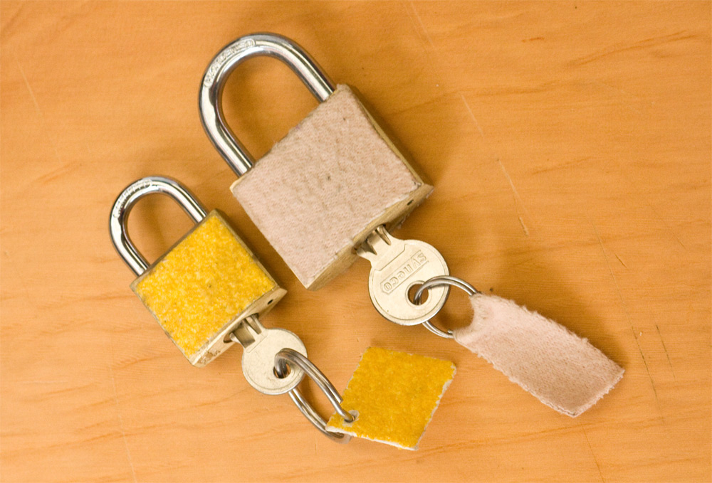
Pictured above are two padlocks with keys in them. The left padlock is covered in velcro and the key has a velcro tag. The right padlock is covered in soft felt and has a matching soft felt tag.
In many ways designing puzzles for a sightless escape room isn’t so different – we’re just substituting a visual cue for a tactile cue. (Plus given that the velcro and felt are different colours already, we’ve actually got both visual and tactile cues here, but in the case of our sightless room we’re just focusing on the tactile elements.) By using props that are easy to identify and by using contrasting textures, players are easily able to make associations about how objects may be connected.
Let’s take the most basic puzzle from The Owl Job. This actually functions as a kind of tutorial puzzle, similar to what you might see in a video game, where you introduce the players to a concept, so that you can later present them with more advanced progressions on the same ideas.
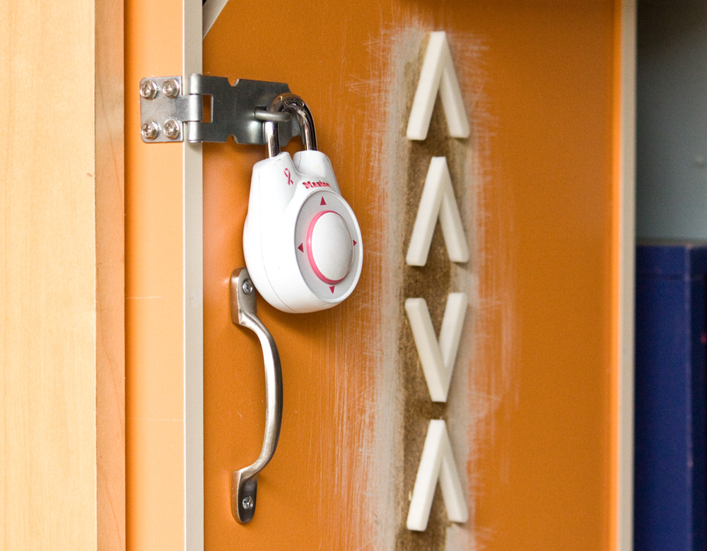
Pictured above is a cupboard locked with a directional padlock. Not far from the lock itself, is column of arrows. In order, these arrows point up, up, down and up.
Now to look at it, this puzzle is straightforward. You’re basically just reading the answer and inputting the combination into the directional lock. But when you remove sight, you have the joy of discovery. Players have to first identify with their fingertips, that these are indeed arrows, figure out which way they point and then figure out their meaning in relation to the padlock.
Now let’s build on that same idea with another puzzle.
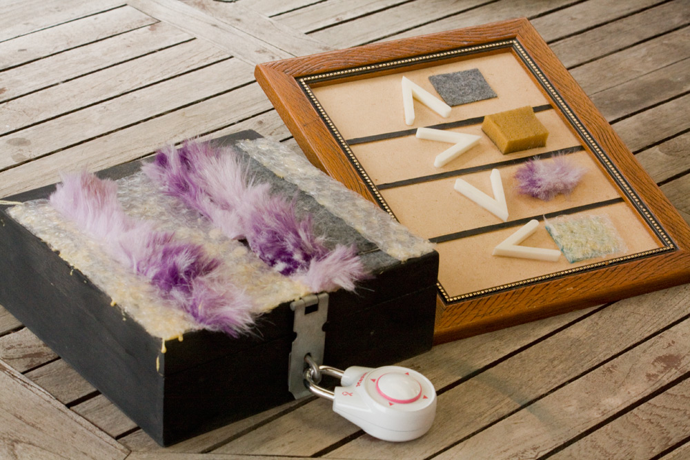
Above are two pictures. The first shows arrows pointing in each of the four cardinal directions: up, right, down, left. Next to each of these arrows is a texture:
- Up: A soft felt cloth
- Right: A squishy sponge
- Down: A fuzzy bit of fur
- Left: Plastic bubble wrap
The second picture depicts of box locked with another directional padlock. The top of this box is striped with a series of varying textures. In order from left to right they are: bubble wrap, fur, bubble wrap, fur, felt, bubble wrap.
So now the arrows aren’t just giving us the code straight away. They’re giving us a cipher that we can follow. By creating associations between two things, we can create chains of logic for the players to follow.
In fact this puzzle would work just fine as a visual puzzle. But I think it’s better as a sightless puzzle, since you have the extra layer of having to explore these two objects in a tactile manner in order to decode their meaning, and eventually, the padlock.
This of course is just the beginning. Beyond shapes and textures, we can create associations with sound, temperature, smell, movement or anything else you can think of.
[wpanchor id=”contrast”]Contrast is communication:
Try to find opposite ends of a spectrum to set any tactile surfaces apart from each other, like soft versus rough. The arrow/texture cipher works because players were able to distinguish between fur, bubble wrap, sponge and felt. If I had chosen materials that were too similar, such as having cotton next to felt, then players may have not even noticed a difference.
Note it’s not important that the players’ correctly identify the exact material. It only matters that they’re able to tell that they’re different. In running The Owl Job, some astute players were able to correctly identify the exact materials – while others might refer to sandpaper as Velcro, or sponge as rubber. But all of them were able to successfully solve the puzzle regardless.
And it’s not just about materials either. There are many dimensions to consider when adding clues and meaning to the props you design:
- Small objects or large objects
- Smooth surfaces or intricate details
- Made of one material, or made of many.
- Temperature: warm versus cold
- Is it solid, or can it be squished?
- Weight: light versus heavy
- Sounds! Does it make sounds when you turn a lever on the side, or maybe it rattles to indicate something is inside?
- Does it have pockets, zips or things to open and unpack?
[wpanchor id=”details”]Details matter:
As with any escape room, you need to take care that you don’t send the wrong signals to players. The arrows in the above example went through several designs so that players could better identify which way they actually pointed.

The first arrow design resembled a chevron, which is a basic equilateral triangle with a notch in the bottom to emphasise which direction it’s pointing. But when you’re feeling an arrow, you’re looking for the points to tell you which way it’s facing – and this arrow has 4 points. Players might find the bottom left or bottom right points of the arrow and deduce it’s pointing south-east or south-west. So this is not a good design solution.

The second arrow design resembled a teardrop, with a point at the top and a rounded bottom. This removed all of the confusing points. But what if players’ only traced their finger around most of this symbol, but not all of it? If they traced the rounded lower half, they would deduce they had found a circle. So again, this isn’t a good solution.
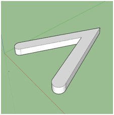
Our final arrow looked like an upside down V, but with the bottom edges rounded. This shape has two points, an inner and an outer, both of which indicate a single direction. That way whether players are tracing from the bottom or the top of the shape, they’ll come to the same conclusion. Lastly, we gave this arrow some depth so that it would literally stand out against a surface. If you would like to use this arrow yourself, I’ll include a link to the 3D model that you can produce with a 3D Printer – download link here.
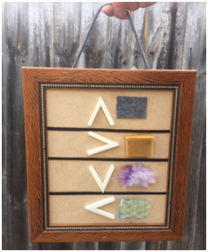
Pictured above: The four arrows/four textures sitting within a picture frame, hanging in a portrait orientation.
The arrow/texture cipher was hung in a picture frame that could be held by its string to indicate its orientation. Without that string, players might hold the frame sideways or upside, which would produce a totally different cipher. You want to avoid having to make your players re-enter the solution four times, just because they don’t know which way is up.
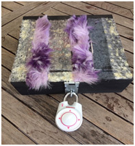
Pictured above: A box locked with a directional padlock, with stripes of varying textures across the entire top lid of the box.
Likewise players need to be able to find the information they need. Initially, this lockbox only had a thin strip of textures running along the bottom part closest to the padlock. However, sometimes players’ hands would skip over this detail because it was too small and easily missed. So we added strips of textures that ran the whole way across the lid of the box. Note that here we are using some assumptions from English, in that this should be read from left to right.
[wpanchor id=”safety”]Safety:
For safety reasons, we don’t recommend using anything breakable that would shatter. That means no glass or porcelain items.
Secondly, try not have anything too heavy. Consider that it is possible players might drop or knock something onto their toes.
If you are going to have food items in your room, consider carefully the potential for people to have allergies. You’ll either need to clearly inform players or find a substitute.
Lastly, no water or other liquids. That’s just going to be a slip hazard when it inevitably spills.
[wpanchor id=”keypoints”]The key points:
- You can encode information via touch, sound, smell, movement etc.
- Consider what details will lead players toward important clues
- What details could mislead your players?
- How can players distinguish between what’s useful for a puzzle versus what has a non-puzzle/set dressing function. If it has no function, should it be there?
